Tension App: Building an inclusive climbing app
What are the needs of beginner climbers and climbers with colorblindness when utilizing a board climbing app? How can the visual design of the existing Tension app be improved on in order to address those needs?
My re-design of the Tension Board
Project Overview
Indoor rock climbing has exploded in popularity with increased media coverage of climbers like Alex Honnold in Free Solo or Tommy Caldwell in The Dawn Wall. Standardized, adjustable walls, known as boards, have emerged as tools for climbers to use.

Example of a climbing board
One of the current leaders in creating climbing boards is Tension Climbing, who has created the Tension Board. A mobile app, Tension App, accompanies the board and allows climbers to connect via Bluetooth in order to visualize problems.
However, climbers have shared that the existing Tension App falls short when it comes to creating an intuitive, accessible user experience.
Project Goals
For this project, I served as the sole user researcher and visual designer. My objective was to learn about the issues that climbers are currently experiencing with the Tension App and propose alternative design solutions that create a more fulfilling app experience.
Context
The purpose of the Tension App is to allow climbers to find, and visualize climbing problems. Each problem varies in the grip types and movement!

Easy boulder problem

Hard boulder problem
Auditing the current app
I first explored the Tension App to gain an understanding of the app’s current features and visual design. As a climber who uses the Tension Board frequently, I have experienced challenges with generally navigating the app and basic features (e.g. finding a problem or saving a problem).
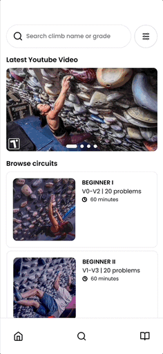
Home Page
~ Disorganized navigation bar
~ Hidden features in the “more” section of the app

Tension App Home Page
Search for climbs
~ There are two places on the app to search for climbs (in “boards” and “more”) which can be quite confusing

2 places to search for a climb
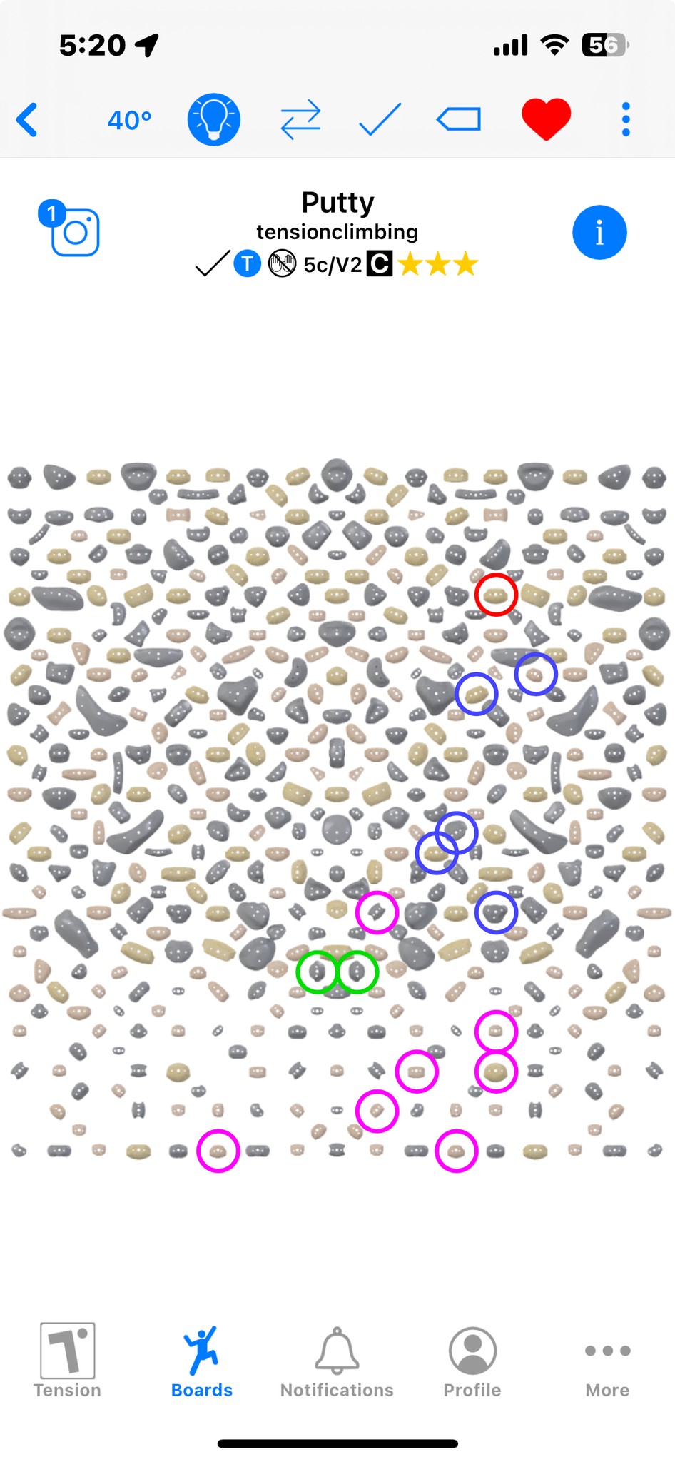
Climb preview
~ Difficult to view the climbing holds
~ Many visual artifacts that compete for attention
~ Uncertainty about the meaning of the colors & not color-blind friendly

Climb Preview
Filter Climbs
~ Toggle heavy which is difficult to use with chalked fingers
~ Lack of specifications on the meaning of the filter (e.g what is a “classic climb?”)

Filter Climbs
Logging climbs
~ Cannot view climb history
~ Flat list of climbs saved

Logging climbs
Problem discovery
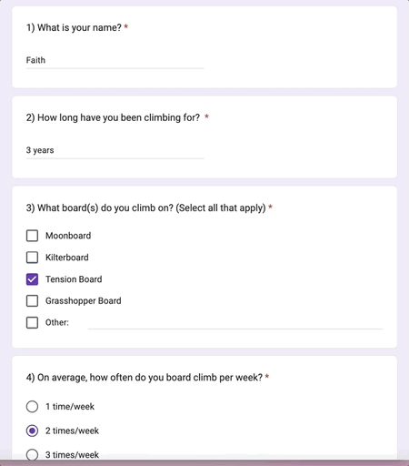
I conducted a survey with 28 climbers to learn about their experience using the board climbing apps. Some of the questions I asked were: What are the most challenging parts about using your board climbing app? What features would you like to see in a new board climbing app? These are some of my high level findings from both the initial survey and affinity map:
• Climbers struggled to effectively utilize existing board climbing apps. due to the unintuitive visual design. Keeping in mind that climbers chalk their fingers, the slider systems and small UI elements are challenging to use.
• Climbers wanted the ability for multiple people to control the board at the same time. Currently, only one climber is able to connect and light the board at a given time. If multiple people were using a board, this climber would be required to switch between problems that others wanted to complete.
• Climbers experience challenges with syncing to the board. Even when climbers were able to connect to the board, they would be randomly disconnected. Or, other climbers could override their control over the board, despite being “first”.
The survey I shared with 28 climbers!
Most importantly, I learned that climbers are all utilizing the boards for diverse purposes and have varying skill levels. Whether it be for rigorous solo training or a casual communal session, climbers simply want the flexibility to easily find problems, connect to the board, and climb cohesively with each other.
Narrowing Scope
Taking into consideration the timeline of the project, as well as the findings from the initial exploration, I wanted to choose a direction to tackle first. I was most curious about designing a feature that would allow multiple people to connect to the board simultaneously because this is something that the Tension App does not yet offer.
The lightbulb feature connects people to the board
First, I reached out to Will Anglin, the CEO/owner of Tension Climbing, and Aurora Climbing, the creator behind the Tension App to inquire about why multiple climbers were unable to connect to a board at a given time. I wanted to know if the Tension Board had the capacity to connect multiple Bluetooth devices simultaneously. This is the response they shared with me:
✉️ “The Aurora controller boxes enable group climbing sessions through the quick switch functionality. By comparison, MoonBoard climbing sessions are difficult because one climber gets control of the board and then no one else can connect. Bluetooth does not allow multiple connections.”
What is the quick switch functionality?
It is important to note that this quick switch functionality that the email refers to is the ability to quickly override someone else’s control of the Tension Board. The quick switch functionality is simply selecting the lightbulb icon. However, imagine climbing a problem and someone changes the light as you are halfway through!
Piveting focus
Reflecting on the email that Aurora Climbing shared with me about not having the capacity to allow multiple users to connect to the board, I pivoted the focus of my project.

The lightbulb feature connects people to the board
Moving forward, I decided that it would be most beneficial to focus on re-designing the UI of existing board climbing apps, as this was one of the major challenges that climbers had shared in the initial survey.
Developing user stories
After organizing user quotes from the initial survey and transforming them into affinity maps, I created user stories to explore concrete needs that climbers have when using the Tension App.
The lightbulb feature connects people to the board
User Stories
• As a new board climber, Kyla (she/her) is nervous about using this training tool and wants the app to be more intuitive, in order to help her find beginner friendly problems.
• As a veteran board climber, Mattias (they/them) wants the app to quickly log his ascents, in order to support them in focusing on their training.
• As a board climber, Devin (he/him) wants the app to have more user-friendly icons and buttons, because the chalk on his fingers makes it more difficult to press on his phone.
• As a color blind board climber, Esther (she/her) wants the lights to be accessible for her colorblindness, because she currently cannot discern between handholds and footholds.
I took time to transform my user stories into tangible questions to guide my work:
How might the app support climbers of all skill levels? Specifically, for beginner climbers who have not used a board before, how can the app facilitate their learning?
How might the app be made to be more accessible for climbers with colorblindness? How do chalk hands impact how users interact with the app?
Initial Sketches + Wireframes
To answer my guiding questions, I returned to my sketchbook in order to think through design solutions!
How might the app support climbers of all skill levels?
When I first started climbing, I had no idea of how often or what to climb. I brainstormed this idea of creating climbing circuits which consists of beginner-friendly problems for newer climbers to try when they start out using the Tension Board.

Sketching the concept of climbing circuits
In addition to having beginner-friendly climbs, the circuits also include tips such as 1) how long to rest for and an 2) intention for how to climb the problems. This is inspired by recommendations that my coach provides me in my own training.
How might the app be made to be more accessible for climbers with colorblindness?
I looked at various color palettes to determine which one I wanted to use for the re-design and ultimately chose one by IBM Design Library.

There is a description that specifies the problem’s movement
The re-designed mobile board also have descriptions such as which holds are the start, finish, hands, and feet. One of the principles of designing for accessibility is presenting information in multiple ways, and I believe that including text is critical to honoring this.
Usability Testing and Results
I conducted 30-minute, in-person interviews over the span of 2 weeks with 10 climbers at my local gym who were gracious enough to review my prototype! Their task was to search for a climb in the V0-V3 range.
10 climbers provided feedback on my lo-fidelity prototype
Feedback
I am proud to share that the re-designed Tension App fulfilled the project’s goal of taking into consideration the accessibility for chalky hands and colorblindness. 10 out of 10 individuals enjoyed the visual re-design of the app and found it more intuitive to use than the former Tension App. Here’s a summary of their feedback:
• I like that the new filter system allows me to easily find climbs of a certain difficulty
• I like seeing a description of the climb’s movement
• I like seeing the start, end, hand, and footholds
• I like the specifications of the new filter system
• I like how clean the new app looks

Climbers felt the filter system was intuitive to use
Though climbers did like the idea of creating circuits with a variety of difficulty levels, they did share some important considerations for the Beginner Circuit specifically.
• I wish climbing vocabulary was defined (e.g what is a sloper?)
• I wish there were more specifications on how to use the circuit
• I wish there was a timer for the circuit

Climbers wished there were more specifications on the circuit
Reflecting on the feedback
Reflecting on the constructive insights from my participants, I took a moment to dig deeper into what this feedback means for my research. I asked the following questions to guide the next step of my project:
How can I support beginner climbers in building their vocabulary for climbing terms/concepts?
How can I convey information about the purpose of the circuits?
Once climbers complete the circuit, what will they gain? Will it prepare them for the next circuit?
Iteration 2.0
I returned to my sketchbook in order to explore possible design solutions to better support climbers in utilizing the beginner circuit. In my second iteration, I wanted the circuit to provide more transparency regarding 1) how long it will take to complete the circuit as well as 2) what problems will be climbed.
In an extension of this project, I would love to further test the new beginner circuit and gather insights.

Circuits provide more transparency
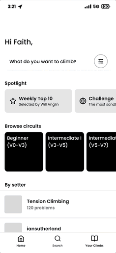
Final Design
After 8 weeks, I delivered the final design solution for the re-design of the Tension App!

Home Page

Search Climb

Filters
Beginner Circuit
Board

Log Climb
Reflections
For my next steps, I am excited to present my solutions to more climbers in a second round of usability testing. I would like to explore how beginner climbers interact with the Beginner Circuit. Would they benefit from having a timer that tracks their rest? To what extend do the descriptions help them building their fluency.
Learnings
• Choose participants for user testing that reflect the goals of the project. As I wanted to focus specifically on beginner climbers and climbers with colorblindness, I found that I needed to actively seek out these perspectives in my recruitment.
• Revisit the project goals by asking questions with tangible concrete outcomes. As someone who can get caught up in the small details, asking myself questions to bring me back to the project’s goals helped me to see the broader picture!